
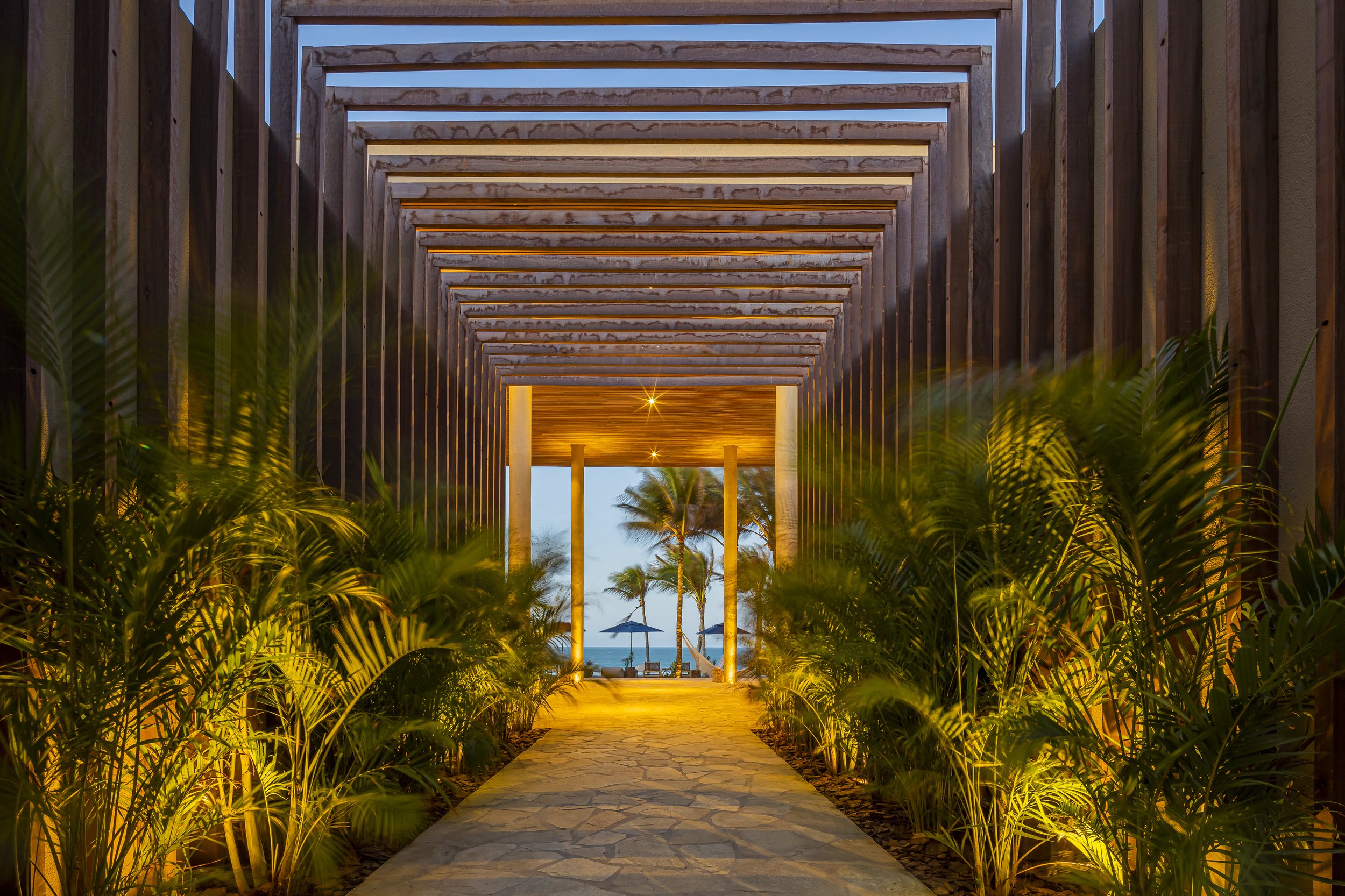
Saline Taíba
Naming, Visual and verbal identity for Saline Taiba, a luxury boutique hotel located on Taíba Beach, on the coast of Ceará, Brazil.
The name Saline derives from the Latin word for "salty," in direct reference to the sea water. It has a distinctive sound and an elegant simplicity that captures the essence of the hotel's character. Memorable and easy to pronounce, sums up the location and the vibe of the property.
Naming, Identidade visual e verbal para Saline Taiba, um hotel boutique de luxo localizado na praia da Taíba, no litoral cearense.
O nome Saline deriva da palavra latina para "salgado", em referência direta à água do mar. Tem sonoridade marcante e uma simplicidade elegante que capta a essência do hotel. Memorável e fácil de pronunciar, sintetiza a localização e a vibe da propriedade.
Symbol and Logotype
The symbol reflects both the letter “S” and hotel’s natural surroundings: the warmth of the sun and the fluidity of the waves and wind. The logo boasts lines that mimics the flow of the waves, while the typography is fluid and airy, conveying the gentle movement of the wind. The color palette emulates the hues of the ocean, featuring deep blues, and the golden sand tones.
O símbolo reflete tanto a letra "S" quanto paisagem natural do hotel: o calor do sol e a fluidez das ondas e do vento. O logotipo traz linhas que imitam o fluxo das ondas, enquanto sua tipografia personalizada é fluida e leve, transmitindo o movimento suave do vento. A paleta de cores emula o azul profundo do mar e os tons dourados da areia.


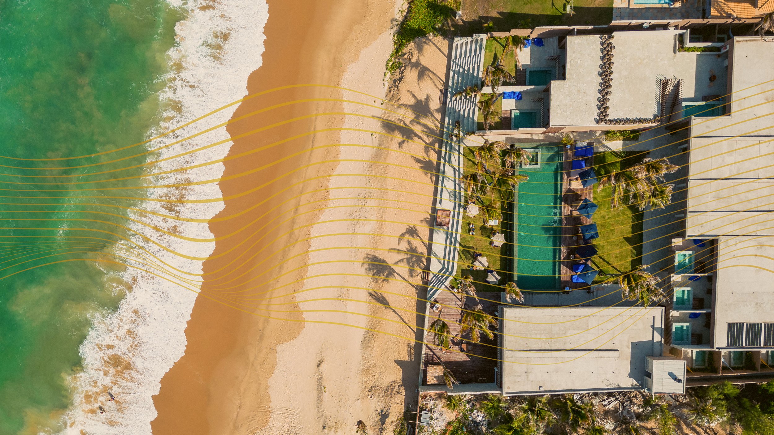
Graphic elements
Sinuous lines reminiscent of the fluidity of wind and waves spread throughout the visual identity, weaving a tapestry of elegance that reflects the character of the hotel. These lines evoke a sense of movement and serenity. Whether found in the subtle details of the hotel's decor or in social media posts, these elements are a reminder of the natural beauty and simple elegance that define the property.
Linhas sinuosas que lembram a fluidez do vento e das ondas espalhadas por toda a identidade visual trazem uma sensação de movimento e serenidade. Sejam aplicados nos detalhes sutis da decoração ou em posts nas redes sociais, estes elementos lembram a beleza natural e a elegância simples que definem a propriedade.
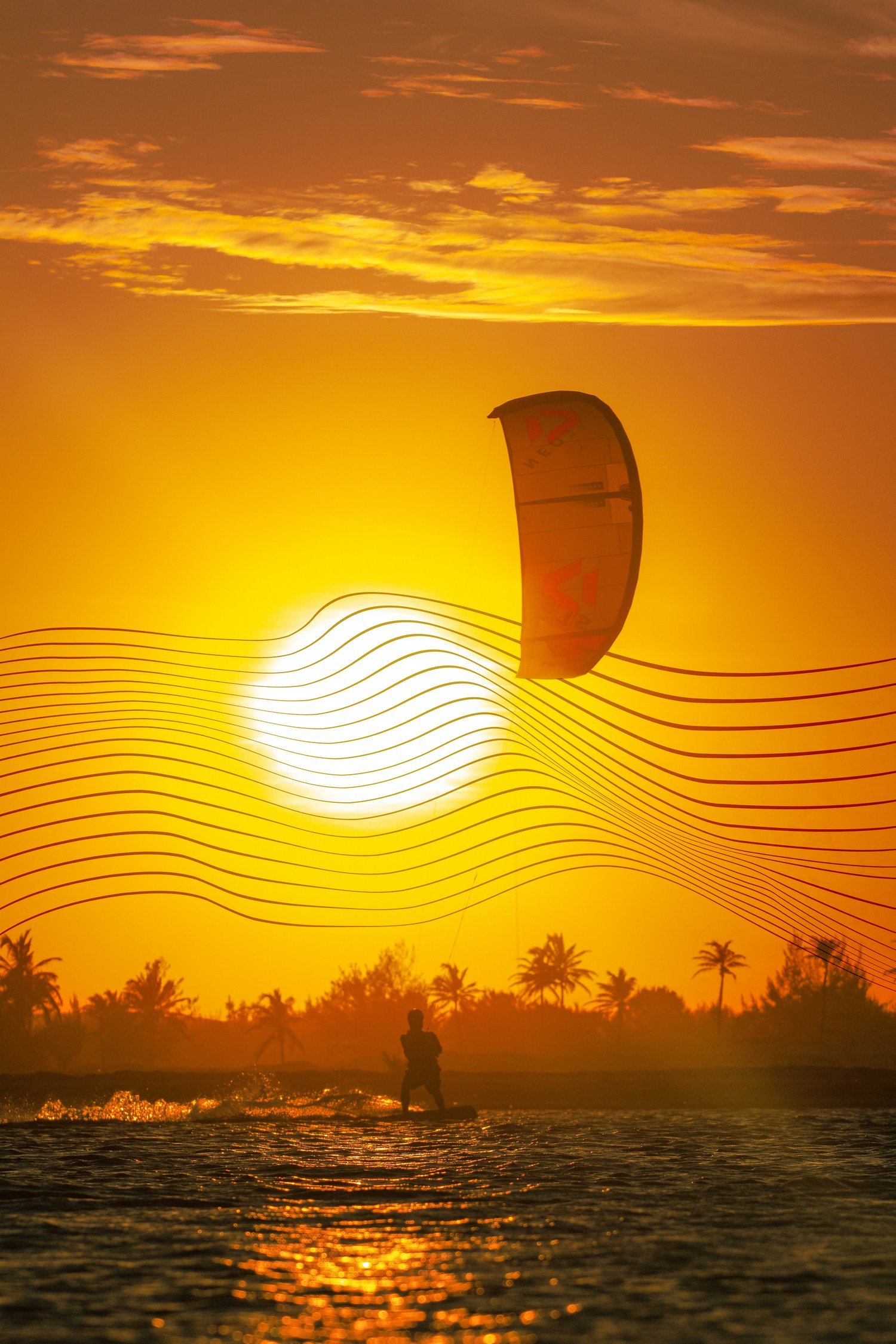
The beachfront hotel is situated in a prime location renowned for its world class conditions for kitesurfing.
O hotel à beira-mar está situado em uma localização privilegiada, conhecida pela qualidade para a prática do kitesurf.

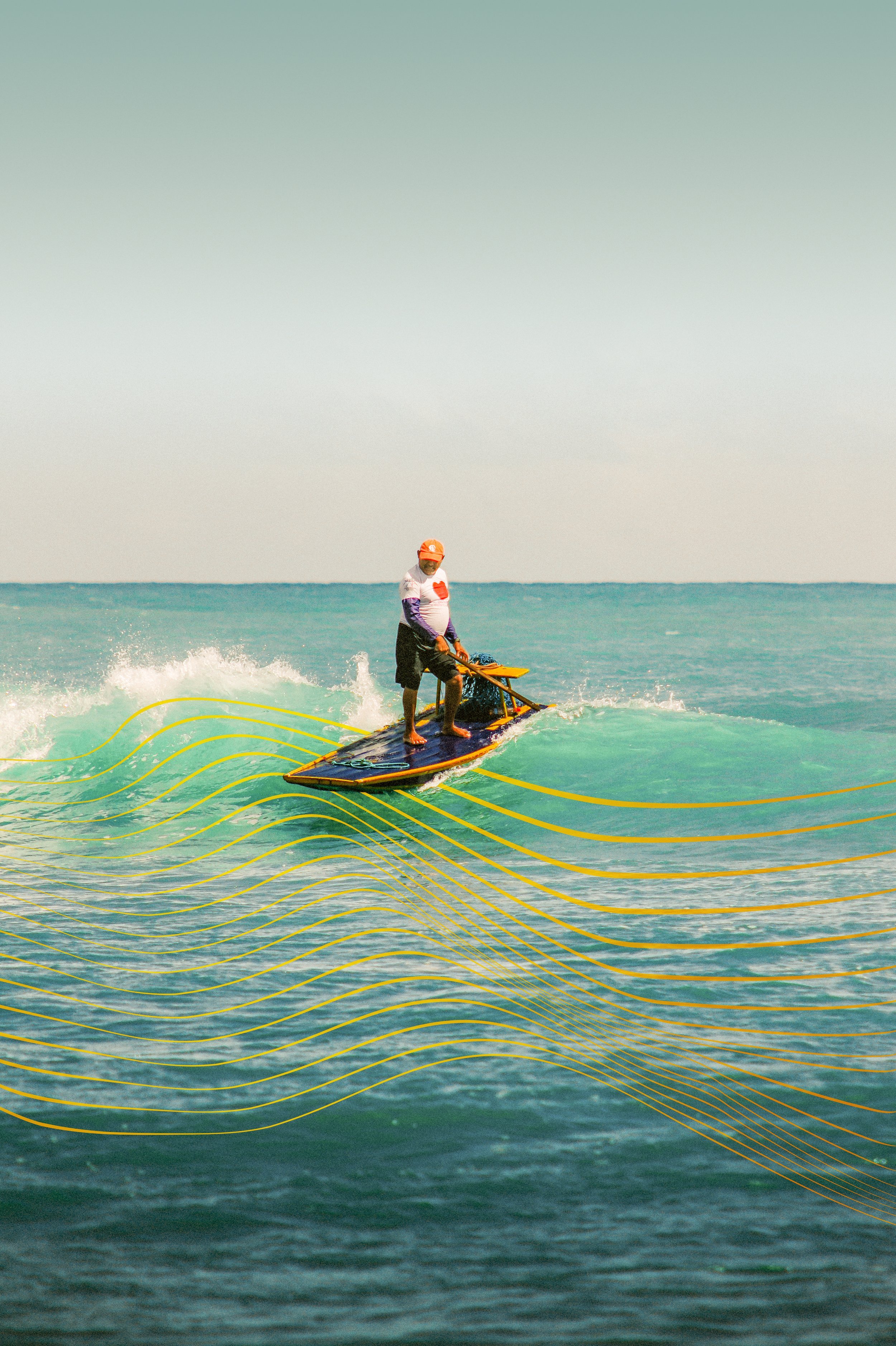
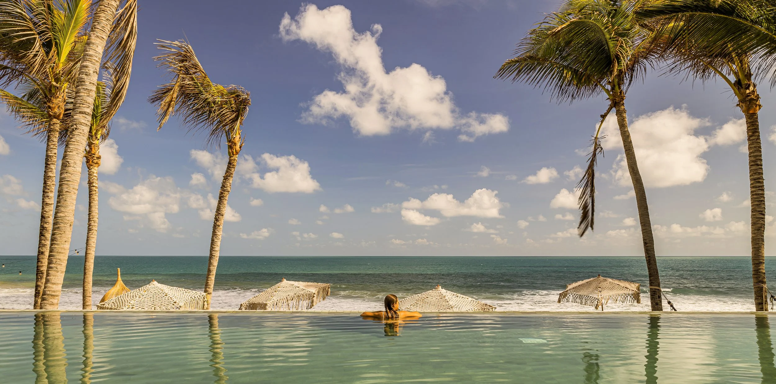
Saline guests enjoy both the refined elegance of the hotel, as well as the simple, picturesque life of the fishing village.
Os hóspedes desfrutam tanto da elegância refinada do hotel, quanto da vida pitoresca da vila de pescadores.


Credits
Naming, visual identity: Studio Cama
Photography: Felipe Petrovsky, Tiago Baliero
Naming, identidade visual: Studio Cama
Fotogtafia: Felipe Petrovsky, Tiago Baliero